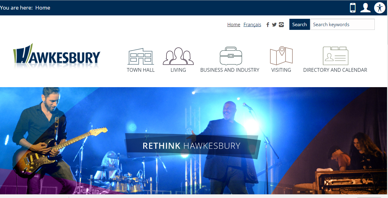
Hawkesbury launched its new website back in the middle of July of this year. It was built by Chabo Design and the content was provided by the city. It may be of interest to note that the new Hawkesbury.ca site has many issues that will, more than likely, turn potential visitors off from visiting based on what I have determined and will highlight.
Why is it important to have a great website? Because first impressions count. If the site is the first thing someone will look at and explore before investing any time or money to visit, it is important that the first impression is great. It’s important for the website to be official, inviting, provide up-to-date content, and act as the authoritative place for conducting city business online. Hawkesbury’s website looks and feels like those fundamental requirements are missing. The landing page, for example, the one that is the first page people see when visiting our website, has little to no content and an obscure request for people to “Rethink Hawkesbury”. There is no welcome message nor any clear “call to action” stimulators. The rest of the site fares no better.
If you’ve taken the time to check the site in detail you will also find broken links and links that lead to wrong pages. A good example is when you click on the Town Hall link (one of the most important links on within the site) and then click on Council you are directed to Buildings and Inspections. It has been like that since the site was launched.
The placing of menu items is poorly done. For example if you click on Publications you are directed to a page that has no links in the body of the page, only on the side menu. This is very bad website practice.
The content on any one page is pathetically poor at best. A website should have fresh and local information written in a manner that speaks with pride, energy and clarity. For example, the entire content on the “What To Do” under “Visiting” is this:
“Hawkesbury offers a variety of activities to suit a public of all ages. Whether you are an outdoor enthusiast, an amateur athlete, a consumer of arts and culture, a gourmet or a fanatic shopper, Hawkesbury and the Prescott and Russell region offers something for everyone. Regardless of whether you are visiting for business or pleasure, Hawkesbury is yet to be discovered.”
That’s it. There are no links to anything. Not even to the Hawkesbury Rec Center. No link to any local restaurant, bar, art exhibit, cultural center, nothing. This is a problem on 90 per cent of the pages. I challenge you to go look and see for yourself. These are your tax dollars being administered by the people you elected representing us, our town with little to no care about our image.
An interesting thing about this site is the Local Directory. I am not sure if it was by design or out of an unwillingness to work but each of the business listing’s logos is that of the city of Hawkesbury, that blue and green “H”. I know that many of the local organizations have often complained about the city’s efforts to take them over so I find the logo business to be sad irony.
The cost of the new site was in excess of $30,000. To be honest, I could have put this site together for less than $2,000. If the site is, as it has been, not updated and improved upon, it isn’t just money wasted but it’s false advertising. So many of the businesses in Hawkesbury have sites that far outdo Hawkesbury’s site with valuable content, a well-organized structure and are well-maintained. You can Google Hawkesbury businesses and find out on your own.
The old Hawkesbury website was far better than what we have now. It’s still out there on the web if you look in the “Wayback Machine” at https://archive.org/web/. The real issue that the town needed to address was its ability to work on other devices like smart phones and tablet. A very simple script placed on each page would have solved that at a fraction of the cost of developing a substandard website. Yes, the new site is mobile-friendly but sure isn’t user-friendly.
The city website administrators really need to ask themselves what the site’s objectives are. What are they trying to accomplish. Are they trying to attract new residents? Are they trying to attract new businesses? Are they trying to facilitate community communication and promote community events? Are they trying to help businesses reach a larger audience? Are they trying to create a cohesive message of unity? The website is a poor attempt and really needs help in order for it to accomplish its objectives.
If you are from Hawkesbury and think that the site is fine, then there is the problem. I’d suggest reaching out to the community for better content as I am sure there are people out here that care far more about our image than the people running our city’s website.
Stephen Sockett
Hawkesbury


