Open-ness. Friendliness. Expansion. Modern. An enduring community where relationships are valued. Space. Tranquility. Those are just a few of the key ideas that consultants from Cundari (a marketing and branding agency with offices in Toronto and Montreal) presented to Champlain Township councillors at the township’s Committee of the Whole Meeting on March 14.
Creating a vision and a mission are part of the rebranding efforts being undertaken by Champlain Township to coincide with its 25th anniversary in 2023. The process began in August of last year and now, consultants are leading the municipality towards identifying a brand and ensuring that staff and the community’s residents are able to connect with that brand. A few weeks ago, four logos were shared on the township’s social media platforms so that people could vote for their preferred logo.
The three groups that the municipality is focused on are: residents, visitors and businesses. Cundari is taking a look at what could set Champlain apart from other area municipalities and as part of that exercise, presented the logos from neighbouring Ontario municipalities and Québec counterparts.
“We have to ask why a business would come here instead of Alfred,” said Zoé Fortin, Communications Specialist with Champlain Township.
The township also has to keep in mind the young people it wants to attract.
Fortin emphasized that the branding exercise involved thinking about “what we want to be” and that from the various logos, there might be hybrid choices and that there would be tweaking along the way.
Candace Turner of Cundary explained to council that the agency would report on what their consultants had heard and discovered during their research to come up with a brand strategy. Reviewing the township’s website and other logos, such as the L’Orignal Campground logo, revealed that existing logos were dated and not design-forward, with the exception of the campground logo, which did convey what it was about.
Rebranding includes creating a design system. The good news, Turner said, was that the township was starting with a clean slate. This is about who you are, Turner said, and about telling that story. Deciding on some risks in order to stand out and ‘picking a lane’ or something special to set the township apart are ideas that she reviewed for council.
Malcolm McLean, Cundari President and Chief Strategy Officer, spoke about the brand ‘DNA’ and how certain themes have emerged. Champlain Township is a kind of cultural crossroad on a geographical level (located halfway between Ottawa and Montréal) and on the language front. A second theme was considering ‘The nature of our nature.’ McLean said the municipality didn’t particularly lean into this and mentioned that certain trends and tastes are important to certain groups.
Another theme he highlighted was ‘Life Stage versus Lifestyle’. McLean said the consulting team became aware that certain segments don’t want to move on or want things to stay the same, while others want to move on. These sentiments can be related to one’s life stage, he pointed out.
A fourth theme was ‘Personal Connectivity.’ WIFI, broadband, and roads are just a few of the ways people connect. There is also a connection and access to larger communities and other connections include the ties to family, friends and community.
Finding what is unique to Champlain Township
Plotting the strategy of a community is finding out what is unique to it, compared to another community.
McLean explained that the vision means the objectives for the township. It is about purpose. The mission is the action part of moving forward. How does the township get there?
“The mission is about how we achieve our purpose,” McLean said, mentioning tone. “It is the way we talk, how we answer the phone and answer emails. It is the ‘what’ — the day-to-day ways we work to bring the brand to life.”
“How do we help Champlain to be sociable, confident, progressive, imaginative and light-hearted?” This strategic language is for the team managing the brand from the inside, McLean emphasized. Thinking ahead, Champlain Township might consider breaking from convention and taking some risks. Making the township more approachable was also mentioned. To attract progressive and younger visitors and investors, the township has to consider better ways better ways to create the lifestyle that people want, he said.
Finding a ‘funner tone’ so that the municipality is not too business-like could also be considered, he said. “We can take growth seriously, but not ourselves,” McLean said, all with a view to making things feel easier and less complicated.
Access is a big connector — for visitors, businesses and residents. Access is at work for everything, from roads to internet services. The municipality can look to see if there are better ways to do things and improve the way people are brought together in Champlain Township.
“How can I better be the brand of Champlain?” McLean proffered, with the aim of repeat visits, repeat business and people telling others about how great Champlain is.
Also at the heart of brand essence is the value of life connections, the value of lifetime relationships and having young people who leave remembering where they come from.
Developing the brand
The township is in the third phase of the rebranding process. The first phase involved research, the brand audit and the implementation plan, at a cost of $8,500. The second phase included the brand strategy, with elements such as brand essence, vision, mission, brand attributes, tone and a creative brief (at a cost of $5,500).
Now in its third phase, is the refreshed logo, colour, brand guidelines, designs for key assets, a brand story and a marketing plan. The marketing plan will cost $10,000 and the other work in this phase will cost $16,000.
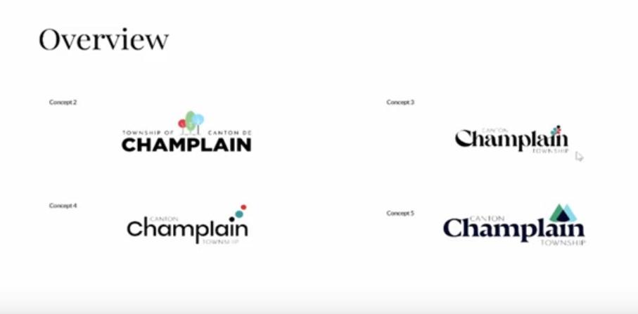
As part of the third phase, four logos were presented to Champlain with a short explanation of each one. Several designs created the concepts, and the designs retained their identification numbers from the original process. Concept 2 was described as being more modern and friendly with three trees close together. Concept 3 featured a colourful oak leaf — a modern design but a traditional approach, with the oak leaf representing nature, knowledge and tradition. McLean referred to bur (or burr) oak. Concept 4 was more about open-ness, friendliness, expansion — all brand elements that were represented by the more whimsical three dots which lifted from the ‘i’ in Champlain. The lower-case type was more friendly, more relaxed, but the dots drifting from the ‘i’ represented movement.
Concept 5 was modern and contained some similar elements, with three triangular-shaped trees, which could represent the cultural crossroads.
West Hawkesbury Ward Councillor Sarah Bigelow asked if the burr oak was native to the area. McLean replied that his understanding was that these trees can be found locally. Bur oak is supposed to be one of the most cold-tolerant oak species. West Hawkesbury Ward Councillor Gerry Miner said that he personally was leery of including trees in the logo. “It’s a matter of opinion, but there are those who question how we treat trees,” Miner said.
Mayor Normand Riopel acknowledged that it was hard to choose right now, adding that he had voted for Concept 3 and told the consultants that in Champlain Township, which has four wards, council tries to make everything as equal as possible.
Some discussion ensued before the consultants signed out of the virtual meeting. But McLean said that it was common to like one logo one day and be more drawn to another one the next day. A lot of information had been presented, he continued, and councillors should take the time to digest it as part of the journey.
“It’s not what you know, but what could be”
Malcolm McLean, Cundari President and Chief Strategy Officer
Responding to a question from Riopel, he said that council should be realistic about what the logo would accomplish. Shape and colour are being used to bring the brand to life. “We encourage you to be bold. We know you have constituents to appease but you could take a bit of risk to stand apart,” McLean said.
It’s not what you know, but what could be, McLean told council.
After the consultants had logged out of the meeting, Bigelow admitted that she did not like one logo better than the other. The oak leaf is not Champlain, #2 looks like something from an animated Dr. Seuss movie and #4 — she wondered how it would look on a sweater or jacket and that the logo with the three triangular-trees looked as if she was looking at something in 3D without the 3D glasses.
Miner pointed out that three of the eight municipal councillors were not present and wondered, “Are we going to decide something here tonight?”
“I don’t want to say the same thing all over again — we’ll have to meet again,” Miner said.
Miner reiterated that he was not in favour of including trees on the logo. Discussion continued about the oak leaf, which some councillors said did not look like an oak leaf.
The mayor raised the need for ‘de’ for Canton de Champlain Township.
The logo design will be discussed again at an upcoming meeting. A special meeting of council takes place on Wednesday, March 22 at 4 p.m. You can find a report on the rebranding project here. The next regular meeting of council is Wednesday, March 22 at 6 p.m. One can watch the meeting live on Youtube or after the fact, or attend in person at the United Counties of Prescott-Russell council chamber in L’Orignal at 59 Court Street.
Implementation of the new branding will take five years. This year, the focus will be on online and internal implementation (website, social channels, internal document templates, signature, letterhead, envelopes and business cards.) Following this, municipal building signage, uniforms and vehicles will receive the new branding image and this could take one to two years. The final phase will address changes needed to way finding/signage, welcome signage, street signs, etc and may take one to two years.